
Meet Zoom AI Companion, your new AI assistant!
Boost productivity and team collaboration with Zoom AI Companion, available at no additional cost with eligible paid Zoom plans.
Updated on October 21, 2024
Published on October 21, 2024


Are you drowning in data but still feeling lost? A clear, concise view of your call center’s performance is no longer a luxury — it’s a necessity. A well-designed call center dashboard provides real-time insights into key metrics, empowering managers and agents to make data-driven decisions that optimize operations, enhance customer experience, and drive business success.
This article will explore the types, features, and best practices of call center analytics dashboards, empowering you to transform raw data into actionable intelligence for exceptional customer service.
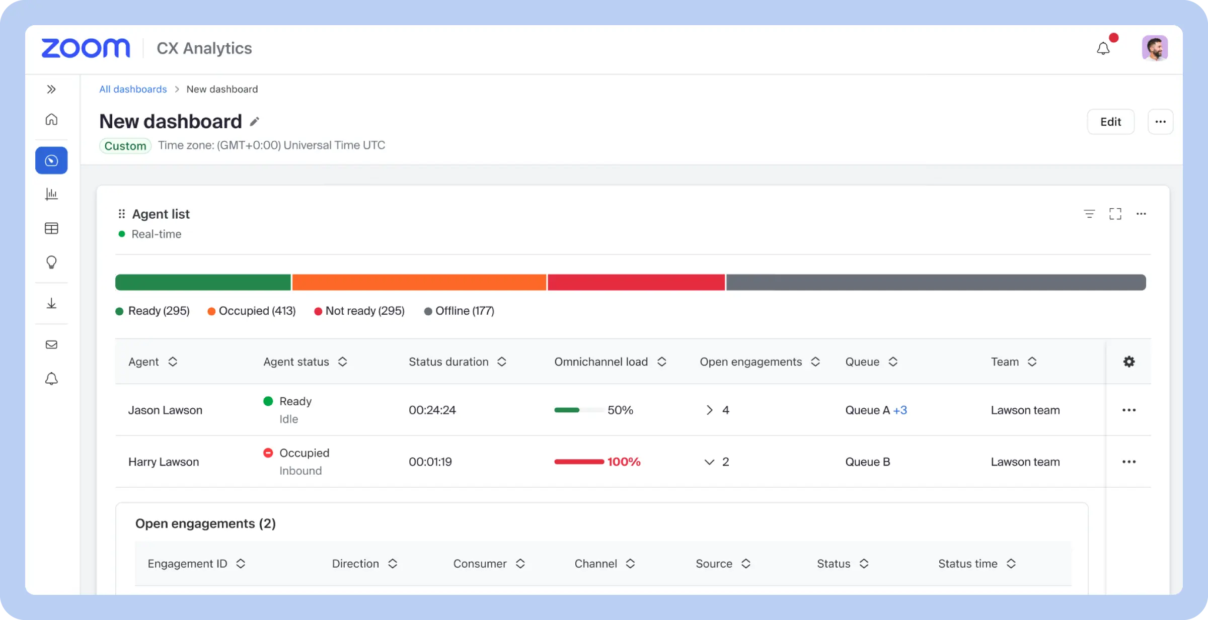
A call center dashboard is a visual tool that provides a real-time, at-a-glance overview of key performance indicators (KPIs) and metrics relevant to a call center’s operations. Think of it as the cockpit for your call center, displaying critical information like call volume, average handle time, agent availability, service levels, and more in a user-friendly format with charts, graphs, and gauges.
The primary purpose of a call center dashboard is to provide managers and agents with the insights they need to monitor performance, identify trends, and make informed decisions to improve efficiency and enhance the customer experience.
But a well-designed dashboard goes beyond simply displaying data. It can also serve as an interactive tool, allowing users to drill down into specific metrics for a more detailed analysis, filter data by various criteria, and set alerts for when key metrics deviate from pre-defined targets. This level of interactivity enables proactive management, allowing supervisors to address issues in real time and optimize resource allocation.
Call center dashboards aren’t one-size-fits-all. Just as a car’s dashboard provides different information than what can be seen in a pilot’s cockpit, call center dashboards are tailored to specific needs and roles. From real-time operational views for supervisors to strategic overviews for executives, here are a few different types of call center dashboards designed to provide the right insights for the right audience.
| Type | Purpose | Metrics tracked |
| Operational dashboards | Provides a real-time view of key call center metrics for immediate action | Call volume, average handle time (AHT), first call resolution (FCR), call abandonment rate, average speed of answer (ASA), service level, occupancy rate, queue length |
| Agent performance dashboards | Tracks individual agent metrics to optimize performance and coaching | Calls handled, AHT, FCR, customer satisfaction (CSAT), quality score, adherence to schedule, after-call work time, knowledge base usage |
| Strategic dashboards | Provides a long-term, high-level view of key metrics to guide business decisions | Customer churn rate, cost per call, revenue generated, customer lifetime value, Net Promoter Score (NPS)*, market share, customer acquisition cost |
| Customer experience dashboards | Tracks customer satisfaction and sentiment to improve the customer journey | CSAT, NPS, customer effort score (CES), social media sentiment, customer feedback, resolution time, FCR |
| Multichannel dashboards | Provides a unified view of customer interactions across all communication channels | Calls handled, emails handled, chats handled, social media interactions, AHT, CSAT, channel utilization |
| Real-time dashboards | Provides a live, up-to-the-second view of current call center activity | Current call volume, longest wait time, agents available, service level, ASA, abandonment rate |
| Historical dashboards | Analyzes past data to identify trends and inform future strategies | Call volume trends, AHT trends, FCR trends, agent performance trends, channel utilization trends |
| Predictive dashboards | Forecasts future trends to optimize call center operations | Forecasted call volume, optimal staffing levels, peak hour predictions |
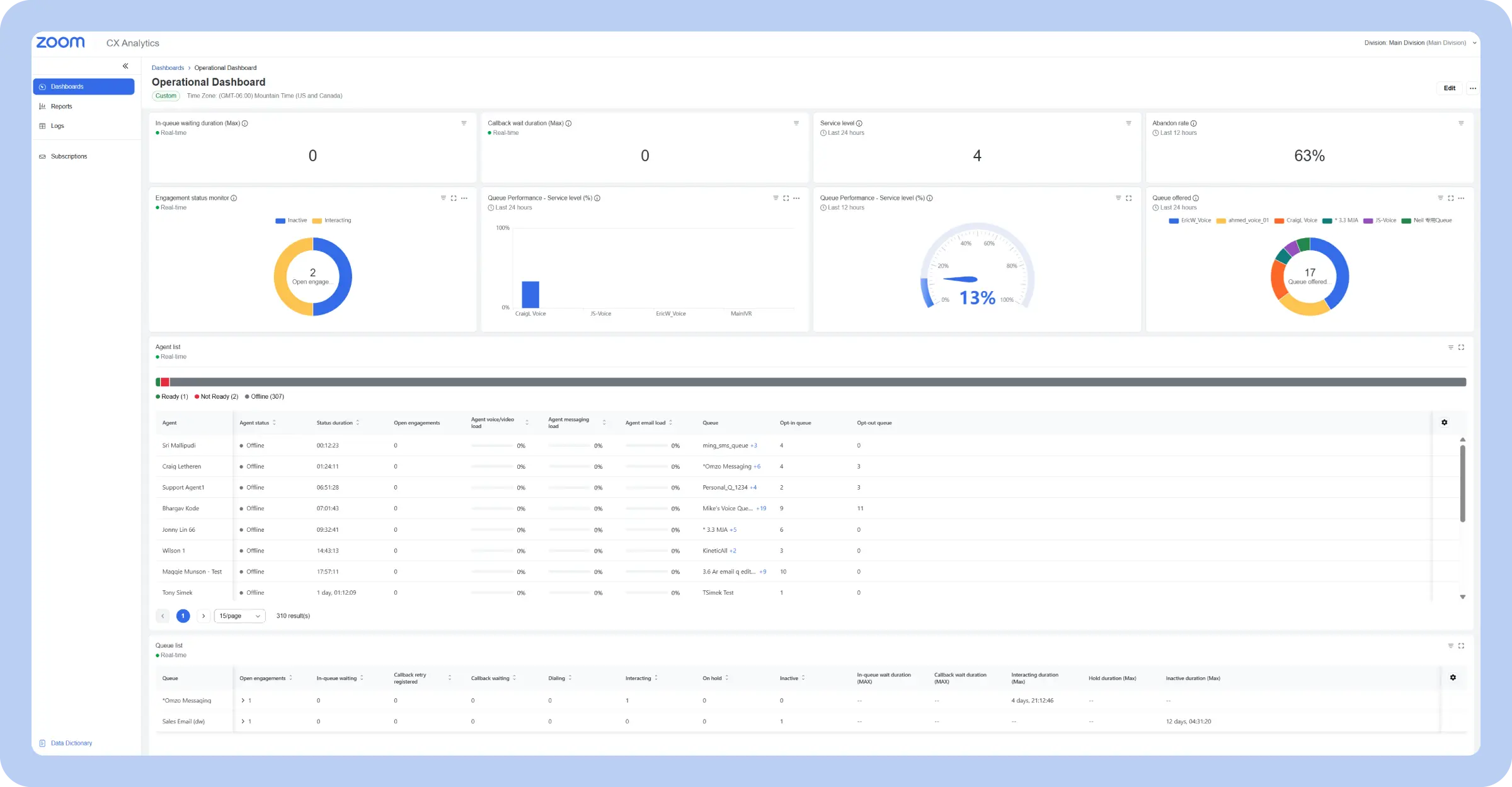
Purpose: Provides a real-time view of key call center metrics for immediate action
Key metrics: Call volume, average handle time (AHT), first call resolution (FCR), call abandonment rate, average speed of answer (ASA), service level, occupancy rate, queue length
An operational call center dashboard provides a real-time snapshot of a call center’s current performance, acting as the pulse monitor for daily activities. It focuses on immediate, actionable data, displaying key metrics like call volume, average handle time, service level, call abandonment rate, and queue length.
These metrics offer a clear picture of what’s happening in the call center at any given moment, allowing supervisors to quickly identify bottlenecks, spikes in call volume, or deviations from target service levels.
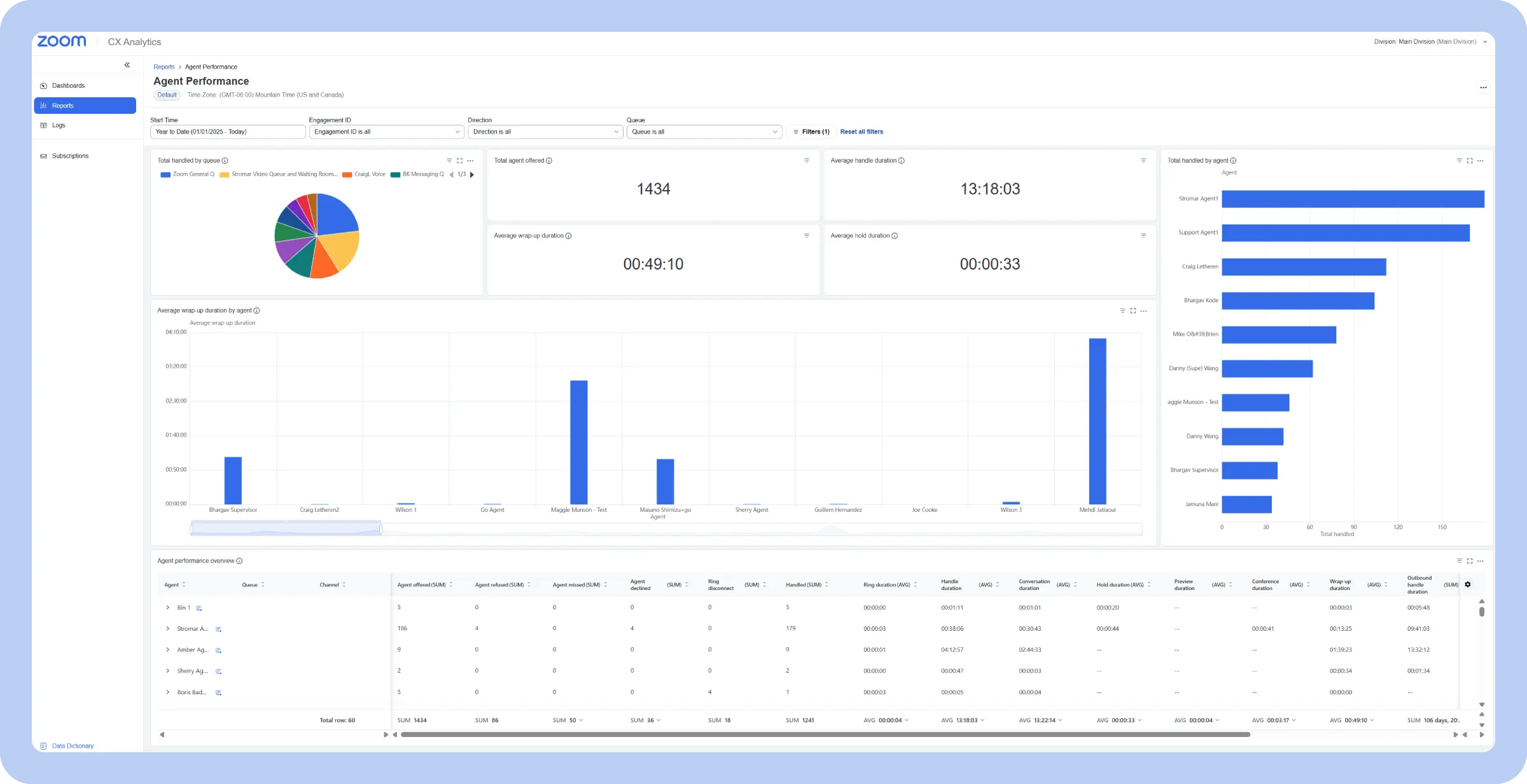
Purpose: Tracks individual agent metrics to optimize performance and coaching
Key metrics: Calls handled, AHT, FCR, customer satisfaction (CSAT), quality score, adherence to schedule, after-call work time, knowledge base usage
An agent performance dashboard focuses on individual agents, providing a detailed view of their productivity and performance. Unlike operational dashboards that look at overall team metrics, this type dives deep into individual contributions, tracking metrics like calls handled, average handle time, and CSAT scores.
This granular data allows supervisors to identify top performers, pinpoint areas where agents might be struggling, and tailor coaching and training accordingly.
Purpose: Provides a long-term, high-level view of key metrics to guide business decisions
Key metrics: Customer churn rate, cost per call, revenue generated, customer lifetime value, Net Promoter Score (NPS), market share, customer acquisition cost
A strategic call center dashboard provides a high-level, long-term view of call center performance, focusing on trends and overall effectiveness rather than real-time fluctuations. It pulls back from the day-to-day and shows KPIs that connect the call center’s work to bigger business outcomes.
The data is often presented in visualizations that show performance over weeks, months, or even years so managers can identify long-term trends, assess the impact of strategic initiatives, and make informed decisions about resource allocation, technology investments, and future goals.
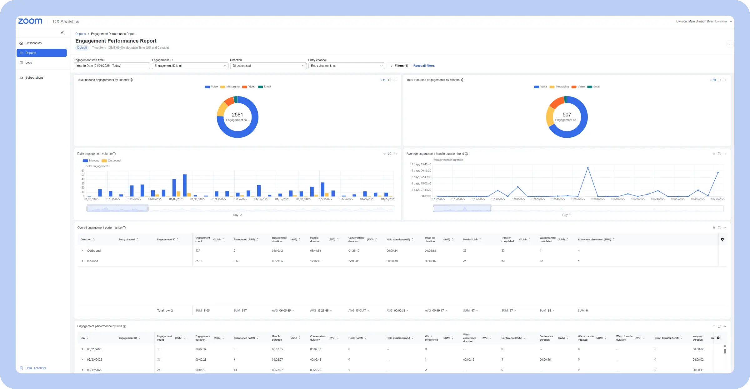
Purpose: Tracks customer satisfaction and sentiment to improve the customer journey
Key metrics: CSAT, NPS, customer effort score (CES), social media sentiment, customer feedback, resolution time, FCR
A customer experience contact center dashboard focuses specifically on the customer’s perspective, providing insights into their interactions and satisfaction levels. It moves beyond traditional operational metrics and delves into how customers feel about their experience with the call center.
Customer experience dashboards are essential for understanding the customer journey and identifying pain points. They help call center managers understand what’s working well and where improvements are needed to create a positive customer experience. For example, a sudden dip in CSAT scores might prompt an investigation into recent changes in call handling procedures or product updates. Keeping an open eye on customer voice and feedback is essential to the experience.
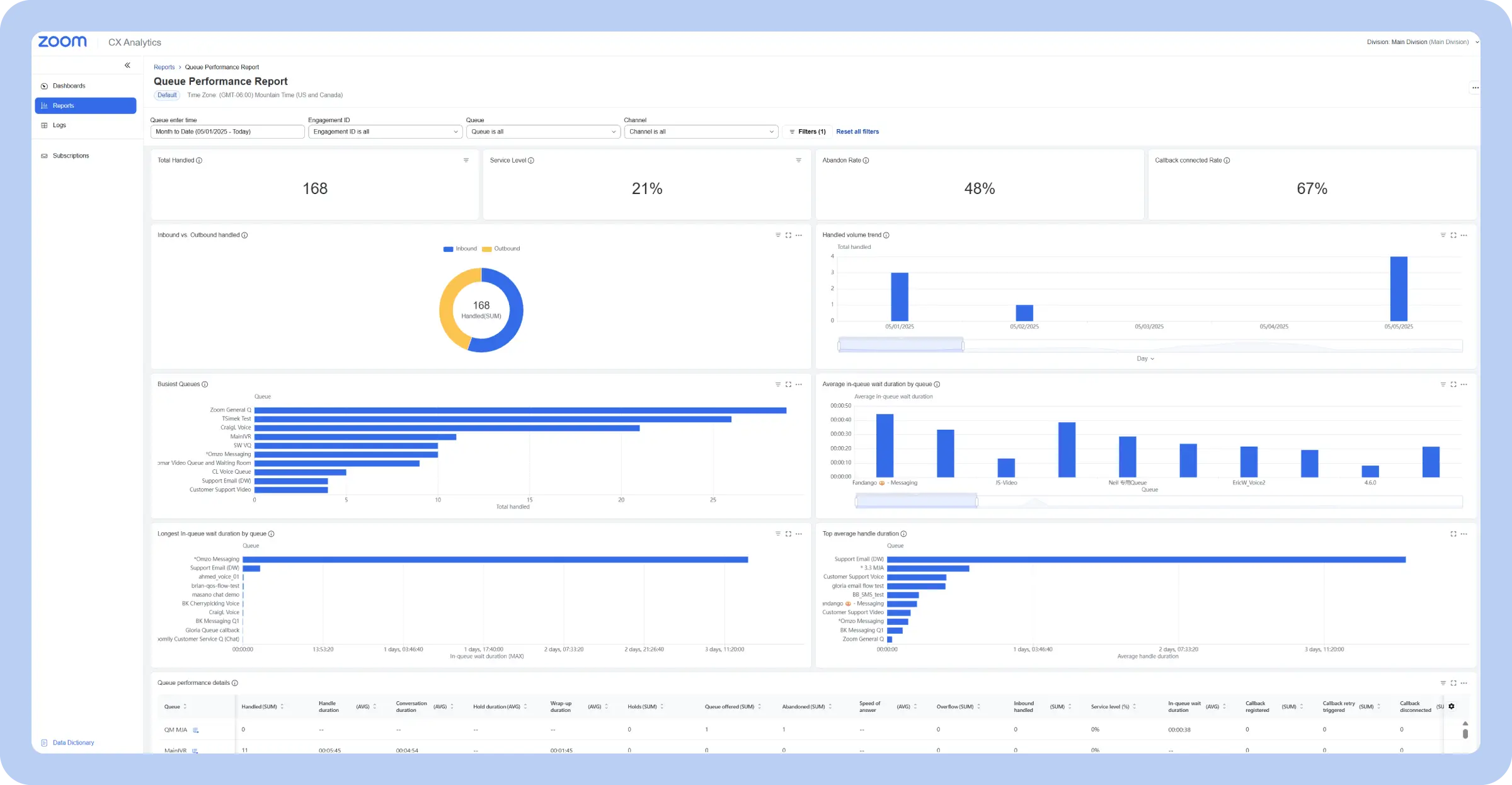
Purpose: Provides a unified view of customer interactions across all communication channels
Key metrics: Calls handled, emails handled, chats handled, social media interactions, AHT, CSAT, channel utilization
A multichannel call center reporting dashboard provides a unified view of customer interactions across all communication channels, moving beyond just phone calls to encompass email, chat, social media, SMS, and other digital touchpoints. It pulls data from each channel, providing a holistic understanding of customer engagement and preferences.
Multichannel dashboards are essential for managing a modern omnichannel contact center. They allow managers to see how customers are choosing to interact with the business and identify any bottlenecks or inconsistencies in service across different channels. For example, if the dashboard reveals a high volume of unanswered emails, it might indicate a need for additional email support staff.
Purpose: Provides a live, up-to-the-second view of current call center activity
Key metrics: Current call volume, longest wait time, agents available, service level, ASA, abandonment rate
A real-time contact center dashboard delivers an immediate snapshot of current call center activity and performance. Visualizations are designed for quick comprehension, often using gauges, charts, and color-coded alerts to highlight critical information and deviations from target metrics. For example, a gauge might show the current service level, with the needle moving into the red zone if it falls below the target threshold.
Real-time dashboards are essential for proactive management and immediate response to changing conditions. Supervisors use them to monitor call flow, identify bottlenecks, and react quickly to any emerging issues. For instance, if the queue length starts to grow significantly, the supervisor can immediately deploy additional agents to handle the increased volume.
Purpose: Analyzes past data to identify trends and inform future strategies
Key metrics: Call volume trends, AHT trends, FCR trends, agent performance trends, channel utilization trends
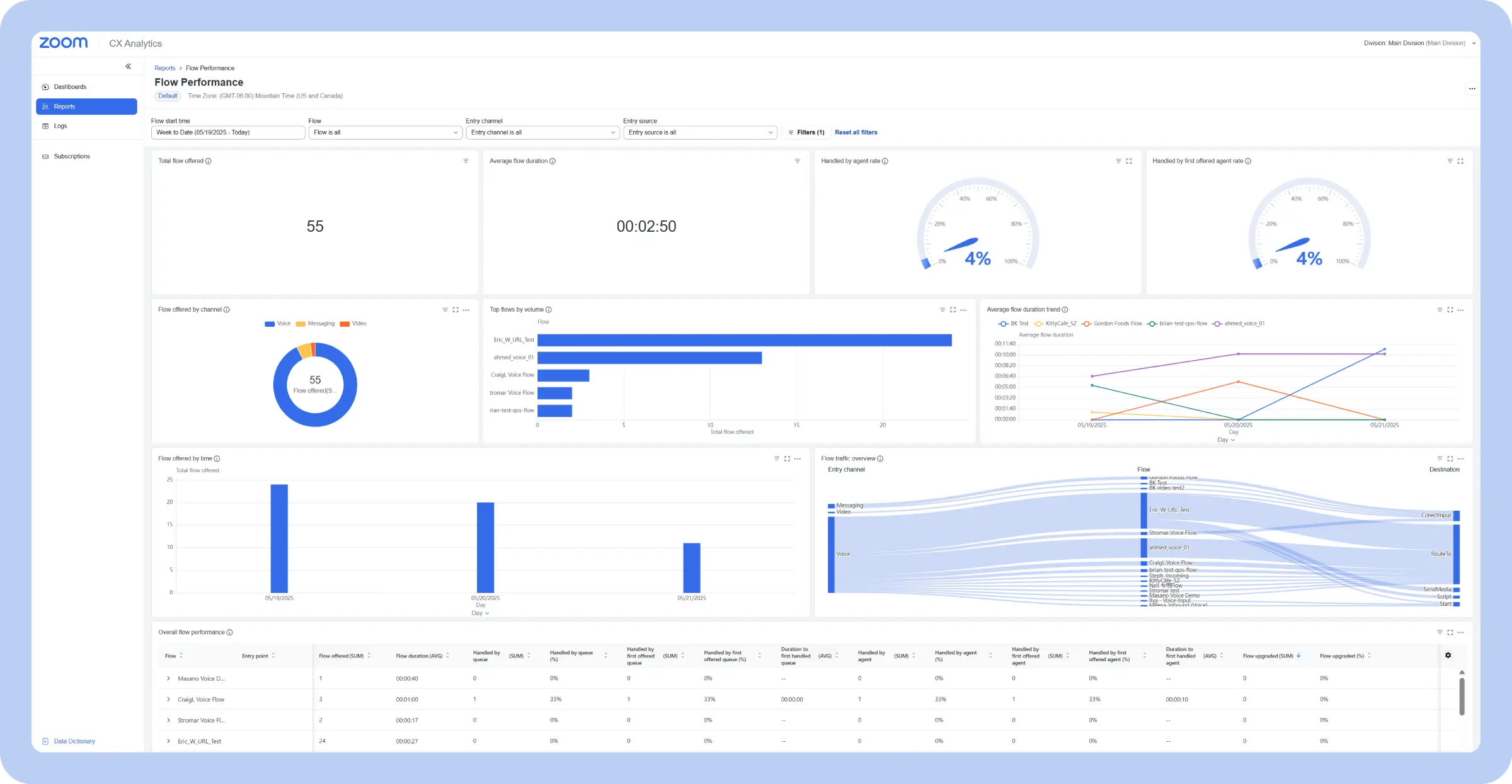
A historical call center dashboard provides a long-term perspective on call center performance, focusing on trends and patterns over time. Unlike real-time or operational dashboards that focus on the present, historical dashboards analyze past data to recognize long-term trends, evaluate the effectiveness of past initiatives, and inform future planning.
Historical dashboards play a major role in strategic planning, performance evaluation, and continuous improvement. They allow contact center managers to spot seasonal trends in call volume, understand the long-term impact of changes to processes or technologies, and measure the overall success of the call center in achieving its goals.
Purpose: Forecasts future trends to optimize call center operations
Key metrics: Forecasted call volume, optimal staffing levels, peak hour predictions
A predictive call center analytics dashboard goes beyond simply reporting on past performance; it uses historical data and statistical algorithms to forecast future trends and anticipate potential challenges. These dashboards leverage predictive analytics to project metrics like future call volume, anticipated wait times, and required staffing levels.
Predictive dashboards are valuable tools for workforce management, resource planning, and proactive problem-solving. Instead of just showing what has happened, a predictive dashboard aims to show what might happen, allowing call centers to proactively prepare and optimize their operations.
Here are some other specialized call center dashboards you might encounter:
Training and development dashboards: These dashboards track agent progress in training programs, knowledge base usage, and other metrics related to agent development.Contact center overflow dashboards: These specifically manage overflow to other teams or locations, tracking metrics like overflow volume, transfer rates, and service levels at overflow locations.
Modern contact center solutions are no longer just about handling calls; they’re about understanding customer interactions and using those insights to drive better outcomes. Below are some ways cutting-edge contact center solutions are using advanced analytics to optimize operations.
Real-time monitoring gives you an instant, complete picture of what’s happening in your contact center right now. It shows you exactly what you need to know — how many calls are coming in, how long people are waiting, who’s available to help, and if you’re meeting your service goals — all on easy-to-understand dashboards and reports.
With this up-to-the-second information, supervisors and managers can jump on problems immediately. Instead of putting out fires later, real-time monitoring lets you prevent them in the first place by re-routing calls, changing staffing, and coaching agents while they’re on the phone.
Historical reporting helps you understand your contact center’s performance over time. It gathers data about calls, handle times, customer satisfaction, and agent performance and puts it together so you can see the big picture.
Good contact center software will let you easily look at past data so you can understand things like busy seasons, find ways to improve, and see if changes you made actually helped. Instead of guessing, you can use this information to make smart decisions about your contact center. Historical reporting isn’t just about looking back; it’s about using what you learned to make things better moving forward.
Agent performance management provides a complete, data-driven picture of individual agent contributions. It tracks things like how many calls they handle, how long their calls take, if they solve the problem on the first call, how happy customers are, and if they’re following their schedule.
Contact center dashboards make this information easy to understand and track, so supervisors can tell who’s doing well, who needs help, and how to best train their team. By focusing on each agent’s strengths and weaknesses, you can make your whole team better, keep customers happy, and improve how you help people.
Modern contact center solutions prioritize customer satisfaction, not just efficient call handling. That’s why focusing on the customer experience is so important. These systems connect with customer feedback tools to figure out how people really feel about their interactions, whether it’s through surveys, after-call questions, or even what they’re saying on social media.
Tracking customer satisfaction metrics like CSAT and CES also helps you see the whole customer journey, from the first time they contact you to how their problem gets solved (and even after). By putting all this together, you can easily see where things are going well and where they could be better so you can make sure every customer has a great experience.
Omnichannel capabilities are a must-have for modern contact center dashboards. Customers today interact with businesses across a variety of channels — phone, email, chat, social media, SMS — and expect a seamless experience regardless of how they reach out. A truly effective dashboard should pull data from all the different ways people contact you.
This way, you can see how customers like to communicate, where things might be getting stuck, and if you’re providing the same level of service no matter how someone reaches out. Having all this information together allows you to help customers effectively on every channel.
Your contact center software should work seamlessly with the other tools you use. It must connect easily with your CRM, your workforce management system, and anything else that holds important data. This interconnectedness streamlines workflows, eliminates data silos, and provides consistent data sharing across the organization.
Your contact center should also automate reports so you don’t have to spend time creating them; they’ll just be ready when you need them. Advanced call center systems like Zoom CX deploy AI solutions to help predict metrics like call volume and handling time, making team scheduling even easier.
Today’s call centers aren’t confined to buildings and cubicles. Many operate remotely, which requires accessible call center analytics dashboards. Cloud-based software makes this easy — you can open dashboards and reports on any device with internet access, whether it’s your computer at work, your laptop at home, or your phone or tablet on the go.
This anytime, anywhere access allows managers to monitor performance in real time, even outside the office, and enables agents to track their own progress and access vital resources from any location.
Creating an effective call center reporting dashboard isn’t as simple as throwing a bunch of metrics onto a screen. A poorly designed dashboard can be overwhelming, confusing, and ultimately useless.
Careful planning and thoughtful design are essential to unlocking the power of data visualization. From defining clear objectives to prioritizing visual clarity, these guidelines will help you design a dashboard that can make a real difference in your call center’s performance.
A truly valuable dashboard isn’t a rigid, one-size-fits-all tool — it’s a flexible platform that can be tailored to users’ specific needs and roles. This means allowing for custom metrics, layouts, visualizations, and even alerts.
Agents need a dashboard focused on their individual performance, while supervisors require a broader view of team activity, and executives a high-level strategic overview. The ability to customize allows each user to see the most relevant information in a format that’s easy to understand and act upon, providing valuable insights at every level.
Static displays of data offer limited insights, but adding interactive features to your contact center dashboard lets stakeholders explore data more deeply and uncover hidden patterns. Here are some examples of interactive elements:
Enabling interactive elements like these turns dashboards into dynamic tools for exploration and analysis, transforming raw data into actionable intelligence.
Don’t rely on manual data entry for your call center dashboard. Integrate your dashboard directly with all relevant data sources for accuracy, consistency, and time savings. This should include, at minimum, your ACD, CRM, and WFM systems.
Depending on your needs, consider other integrations, like quality monitoring tools, survey platforms, and even social media listening tools. Direct data feeds from these sources will automate updates, providing a single, reliable view of your call center’s performance. This eliminates data silos and equips you with real-time insights for more effective management.
Don’t just settle for the basics when designing your call center dashboard. Explore the advanced features offered by your contact center platform to unlock deeper insights and streamline your workflow.
For example, take advantage of predictive analytics to forecast call volumes and optimize staffing schedules proactively. AI-generated insights can highlight hidden trends and patterns in your data, revealing opportunities for improvement you might otherwise miss. Automate reporting to save time and provide key stakeholders with regular performance updates without manual intervention.
If you’re using Zoom CX, explore tools like Zoom Virtual Agent for AI self-service, which can help you solve customers’ needs fast, while continuously optimizing the care it provides. Leverage Zoom Workforce Management to automate forecasting, scheduling, and intraday management capabilities, optimizing your workforce and improving efficiency. By embracing these advanced features, you can transform your dashboard from a simple reporting tool into a powerful engine for continuous improvement.
Embracing the power of a well-designed call center dashboard equipped with helpful features can turn your contact center into a strategic asset.
Comprehensive solutions like Zoom CX offer built-in AI-first analytics that provide real-time insights into agent performance, customer experience, and overall operational efficiency.
From real-time dashboards and historical reporting to true omnichannel analytics and AI-powered forecasting, you’ll have a single data source of truth that pulls all the data you need into one view. These in-depth insights can help your team optimize staffing, personalize customer interactions, and more, according to your business needs. Get the most out of your call center analytics and reporting with Zoom CX today.
* Net Promoter®, NPS®, NPS Prism®, and the NPS-related emoticons are registered trademarks of Bain & Company, Inc., NICE Systems, Inc., and Fred Reichheld. Net Promoter ScoreSM and Net Promoter SystemSM are service marks of Bain & Company, Inc., NICE Systems, Inc., and Fred Reichheld.


